Creation of Mitsui’s own original font
— “Mitsui and Co Sans”
The Mitsui & Co. Branding Project began in 2014.
Since then, we have refreshed and unified the Mitsui logo, bringing consistency to the multiple different versions that had evolved independently at locations around the world.
Another key aspect of the Brand Project has been the creation of “Mitsui and Co Sans”, an original English font, designed with the aim of building the global recognition of
Mitsui & Co. and further enhancing our global brand image by creating a heightened sense of unity in our messaging. *“Sans” stands for sans-serif font.
Creation of Mitsui’s own original font — “Mitsui and Co Sans”
The Mitsui & Co. Branding Project: Initiatives to date
The Mitsui & Co. Branding Project began with the renewal of our logo in 2014. We refreshed and unified the Mitsui logo, bringing consistency to the multiple different versions that had evolved independently at locations around the world.
Guided by the principle that “Each employee is a medium for brand building,” we have since implemented a wide range of initiatives, including developing PR tools to enhance the sense of unity of our brand, spreading awareness of our branding within the company, and using digital media to disseminate information to external audiences.
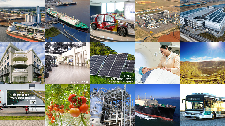
Currently, we are focusing on the Kokorozashi Project, which is a messaging initiative targeting businesspeople in their 20s and 30s in Japan. Looking ahead, we plan to expand the scope of our brand communications globally, aligning with our ongoing Japan-based initiatives.
We believe that the creation of our original “Mitsui and Co Sans” font will promote a heightened sense of unity in our brand communications, and will support the global expansion of the Mitsui & Co. brand.
Background to the creation Mitsui’s original font
In 2022, we began to consider how we could further utilize our logo to foster a greater sense of unity, engagement, and motivation among employees. At the time, given our desire to expand our initiatives globally, we began to consider the idea of creating an original font. This was prompted after questions were raised about how the names of our overseas offices should be written together in a way that created a sense of unity with our logo.
Even if our logo, photos, graphic design and UI design are top notch, if the font lacks harmony with the overall design, the intended message we want to convey through our branding may not be fully grasped by the viewer.
Our belief is that by using an original font that is in harmony with our logo, we can enhance the sense of unity in our communications. This applies to company-wide communications or presentations by individual employees, irrespective of scale. It conveys our commitment to trust, sincerity, and accuracy, thereby contributing significantly to the enhancement of our brand image.
We will continue to utilize the original Mitsui and Co Sans font in a variety of situations to bring a heightened sense of unity and consistency to the materials we produce, as we aim to further improve our global brand recognition and brand image.
Mitsui and Co Sans – key characteristics
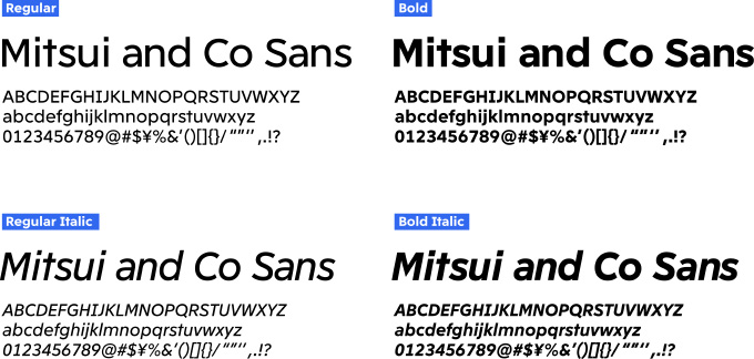
Font name: Mitsui and Co Sans
“Sans” stands for sans-serif typeface.
Design details: Basic European + Central European languages, 33 languages in total
Regular font, Bold font, and Italic forms of both (4 fonts in total)
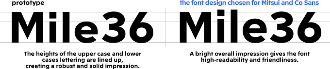
Based on the current logo design, the Mitsui and Co Sans font is designed to be modern, bright, and impactful while giving a sense of familiarity and readability.
For example, as with the letters in the current logo, the letter M is designed slightly narrower, and the letter S is slightly wider. The letters are slightly different from the familiar rhythm of typical Latin fonts, making it eye catching and impactful.
In addition, the height of the lowercase letters is higher than that of the uppercase letters, increasing the amount of white space and creating a brighter overall image, and bringing a greater sense of familiarity.
-

-
Comment from Kashiwa Sato, Creative Director / Representative at SAMURAI
When designing the global logo, which was a refined version of the igetasan (Mitsui’s house seal with the Japanese character for “three” in the center of an igeta, which is a rotated square with overlapping bars), we wanted it to convey Mitsui’s corporate story and be a symbol that people around the world could commonly recognize. Starting with the logo, throughout our design process we had constantly placed a focus on how to express the uniqueness of Mitsui. The font design was an extension of this, and it was a very enjoyable process to test and refine every detail.
As part of the corporate branding phase, once the brand purpose is redefined and the global logo is established, the next thing that is needed is a font. With the birth of the original Mitsui and Co Sans font, the brand assets that embody Mitsui & Co. now come together to form a complete and cohesive package.
I have been involved in Mitsui’s branding for 10 years. I believe that the essence of effective branding lies in envisioning how the brand can continue to shine while adapting to evolving business models according to the times and environment. In this sense, you could say that creating a font is like building the environment in which the brand lives. I believe it is important to create a font that will resonate not only with external audiences, but also with those within the company.